Brand Definition
The Foundation of E3E3 XPS helps organizations create meaningful experiences through custom exhibits and branded environments that maximize engagement.
Whether it's a trade show exhibit, corporate interior, branded activation, or event environment, every space is an opportunity to create a lasting impression. The most impactful connections happen face-to-face. By combining strategic thinking, creative design, and exceptional craftsmanship, E3 creates experiences that inspire confidence and leave a lasting impact.
Desired Associations
The keywords we consistently use to build the associations we want audiences to connect with the E3 XPS brand.
Trust
proventrustedreliablepeace of mindconsistentdependableService
supportiveunparalleledexceptionalattentivecollaborativecomprehensiveExpertise
dedicatedexpertsin-depthsavvyexperiencedfocusedImpact
maximize(d)strategicresultscreativeinnovativepurposefulOthers
turnkeyexhibitsenvironmentsengagement(s)spacesThe Difference
Four steps that set the standard by which E3 XPS lives as a company — and set it apart from the competition.
CONSULTATION

Understanding every need
COLLABORATION

Exploring every option
EXECUTION

Covering every detail
EVALUATION

Following-up every time
Tagline Standards
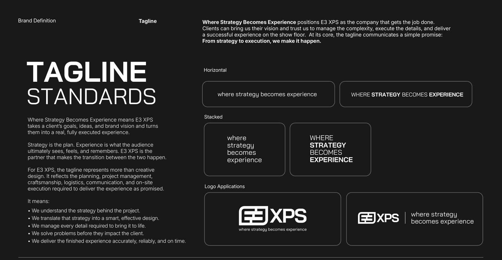
Where Strategy Becomes ExperienceWhere Strategy Becomes Experience positions E3 XPS as the company that gets the job done. Strategy is the plan; experience is what the audience ultimately sees, feels, and remembers. E3 XPS is the partner that makes the transition between the two happen. At its core the tagline communicates a simple promise: from strategy to execution, we make it happen.
Approved Lockups our new tagline
Horizontal, stacked, and logo-application treatments — sentence case or all caps as shown.
Logo Standards
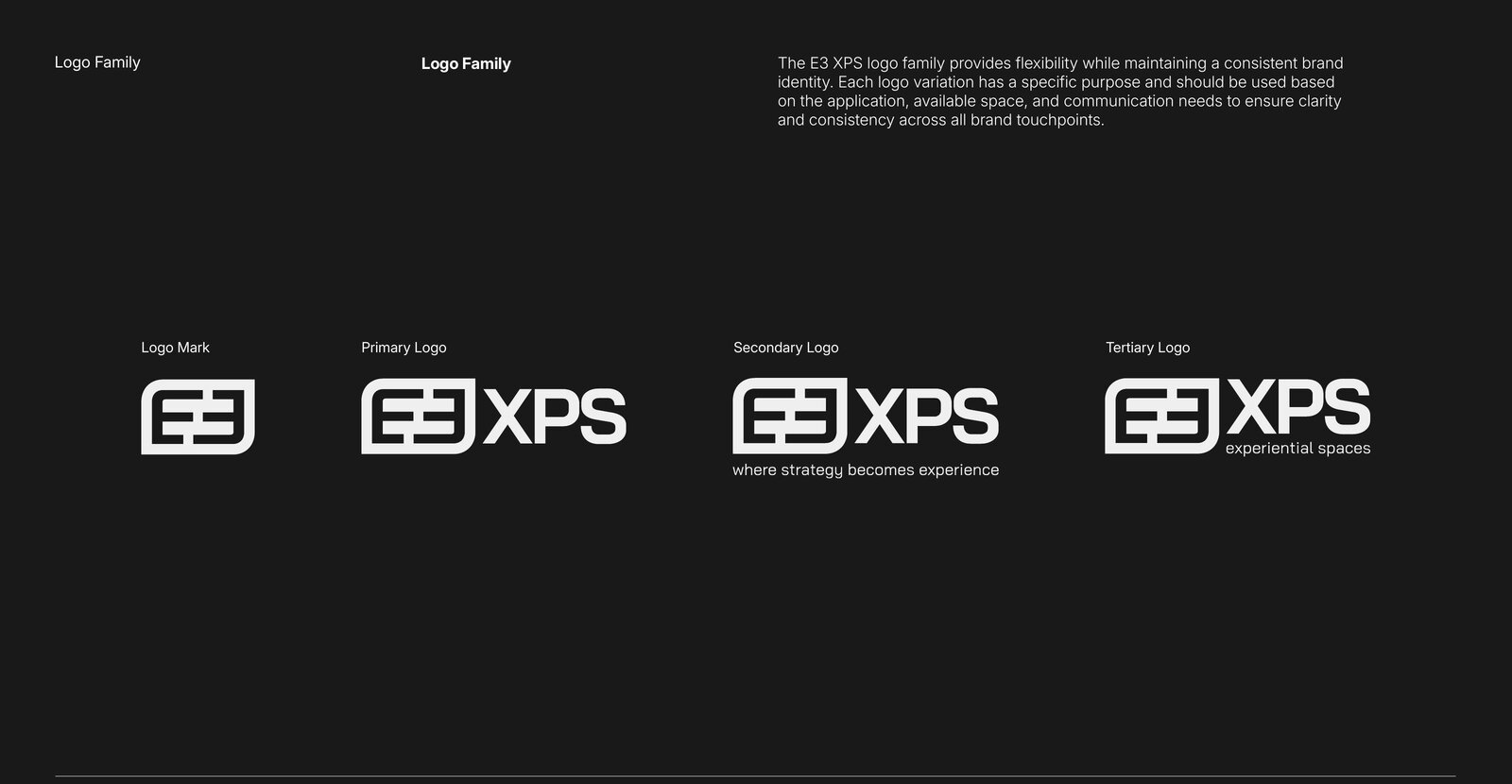
Identity SystemThe E3 XPS logo family provides flexibility while maintaining a consistent identity. Each variation has a specific purpose — choose based on application, available space, and communication needs.
Logo Family
Logo Mark · Primary Logo · Secondary Logo (with tagline) · Tertiary Logo (experiential spaces).
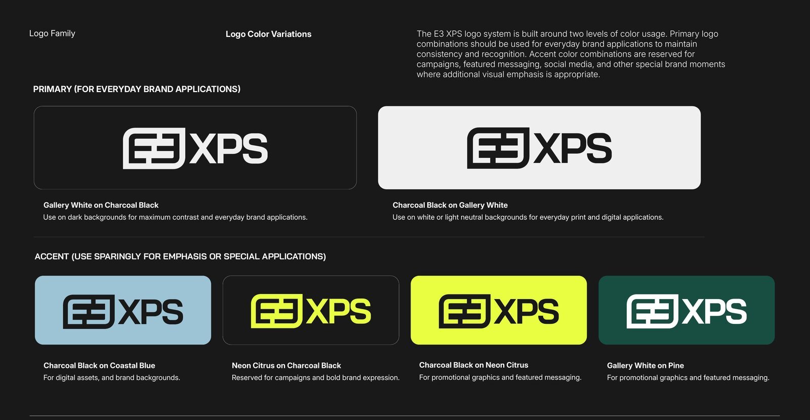
Color Variations
Primary combinations (Gallery White on Charcoal Black, Charcoal Black on Gallery White) are for everyday use. Accent combinations (Coastal Blue, Neon Citrus, Pine) are reserved for campaigns, featured messaging, and special brand moments.
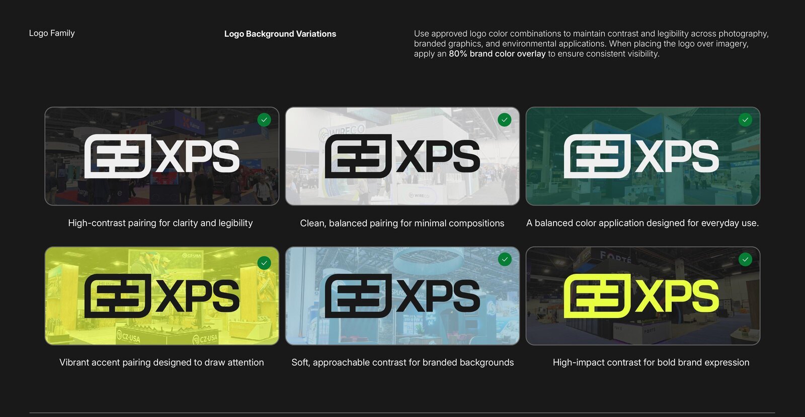
Background Variations
When placing the logo over imagery, apply an 80% brand-color overlay to ensure consistent visibility.
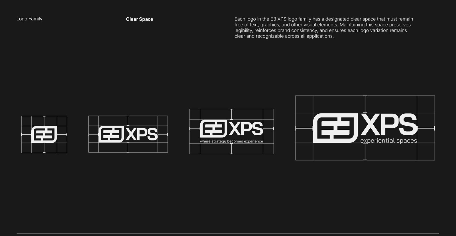
Clear Space
Each logo has a designated clear space that must remain free of text, graphics, and other visual elements.
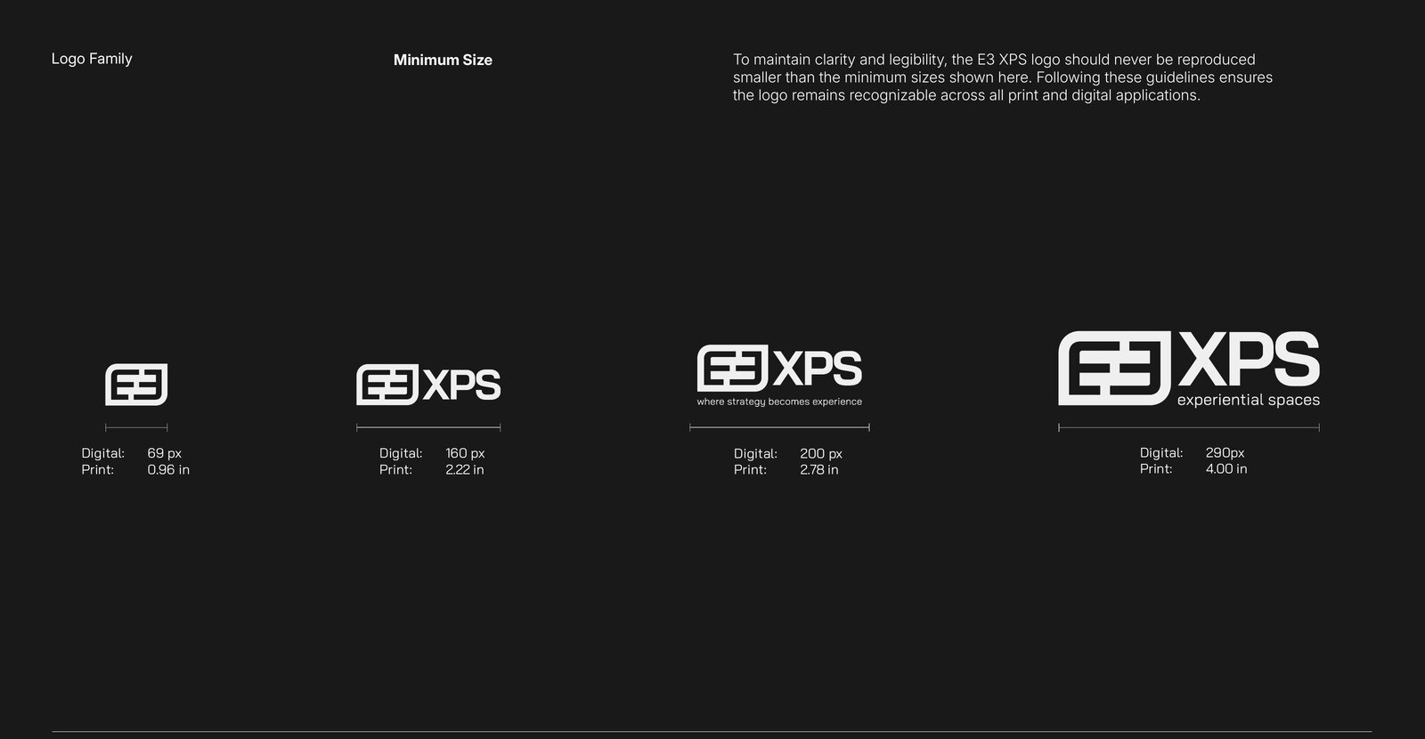
Minimum Size
Logo Mark 69 px / 0.96" · Primary 160 px / 2.22" · Secondary 200 px / 2.78" · Tertiary 290 px / 4.00".
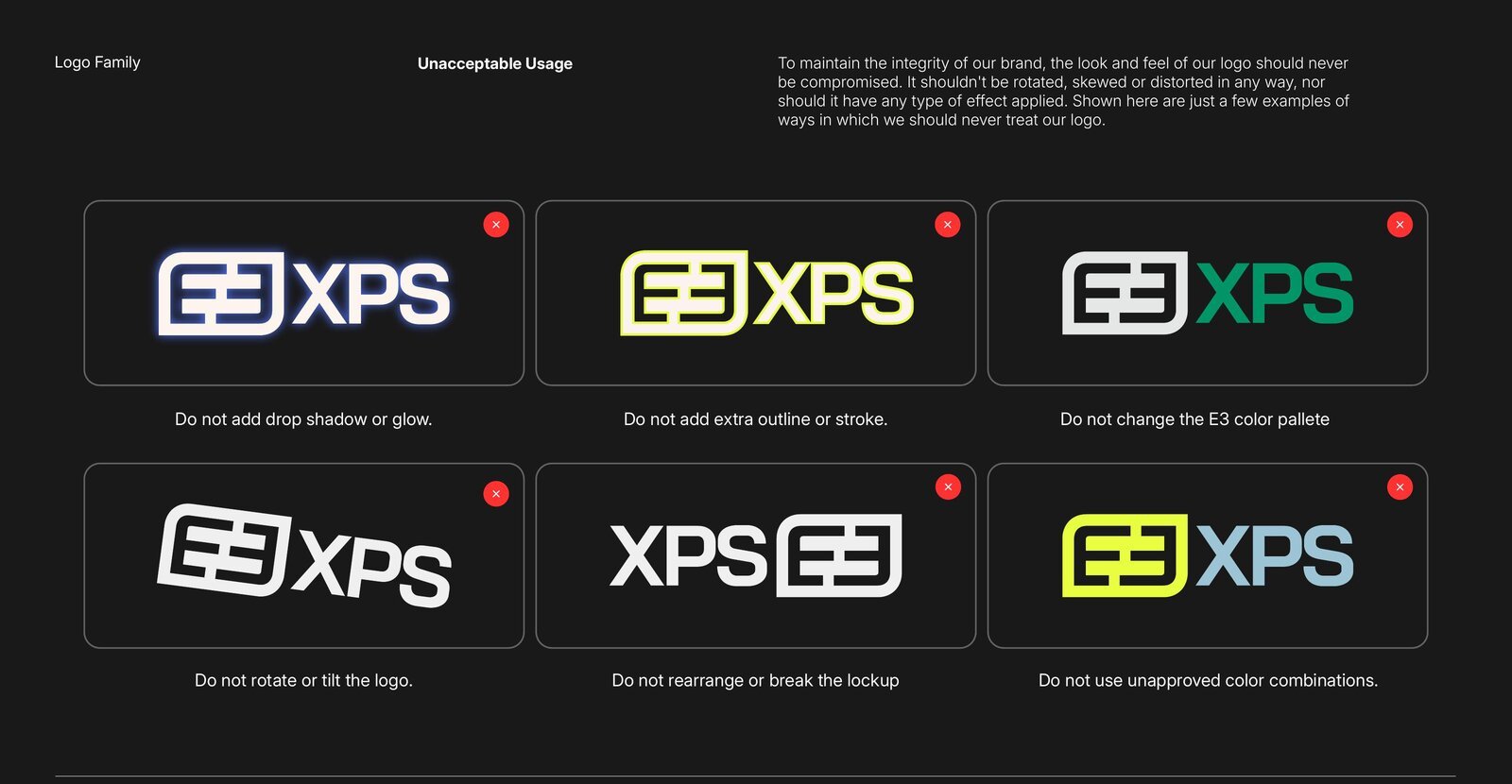
Unacceptable Usage
Never rotate, skew, distort, re-color, outline, add effects to, or rearrange the lockup.
Color
Brand PaletteCharcoal Black and Gallery White form the foundation, Coastal Blue and Pine provide flexibility, and Neon Citrus adds emphasis where it matters most. click a hex to copy it!
Typography
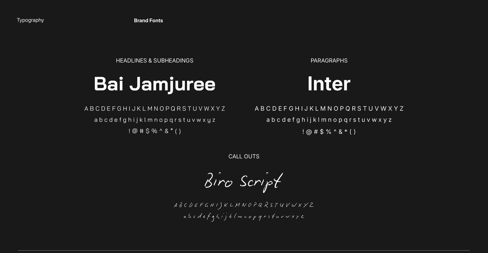
Brand FontsBai Jamjuree is the primary brand typeface — bold, modern, and technical. Inter handles paragraphs and longer-form content. Biro Script is reserved for handwritten call outs.
abcdefghijklmnopqrstuvwxyz
!@#$%^&*()
abcdefghijklmnopqrstuvwxyz
!@#$%^&*()
abcdefghijklmnopqrstuvwxyz
Hierarchy
Bold · 150 px
Medium · 60 px
Regular · 21 px
Semi Bold · 16 px
Script · 36 px
Specimen
Design Standards
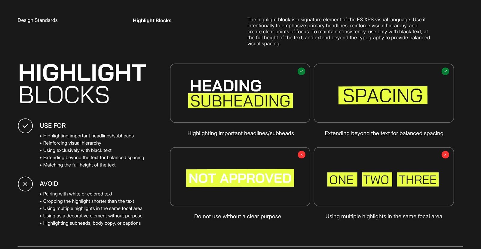
Principles & LayoutSignature elements — highlight blocks, handwritten annotations, and supporting graphic accents — are used intentionally to reinforce hierarchy, emphasize key messaging, and create a consistent visual language.
Highlight Blocks
Subheading
✓ Use for
- Highlighting important headlines/subheads
- Reinforcing visual hierarchy
- Black text only, at the full height of the text
- Extending beyond the text for balanced spacing
✕ Avoid
- Pairing with white or colored text
- Cropping the highlight shorter than the text
- Multiple highlights in the same focal area
- Decorative use without purpose · highlighting body copy or captions
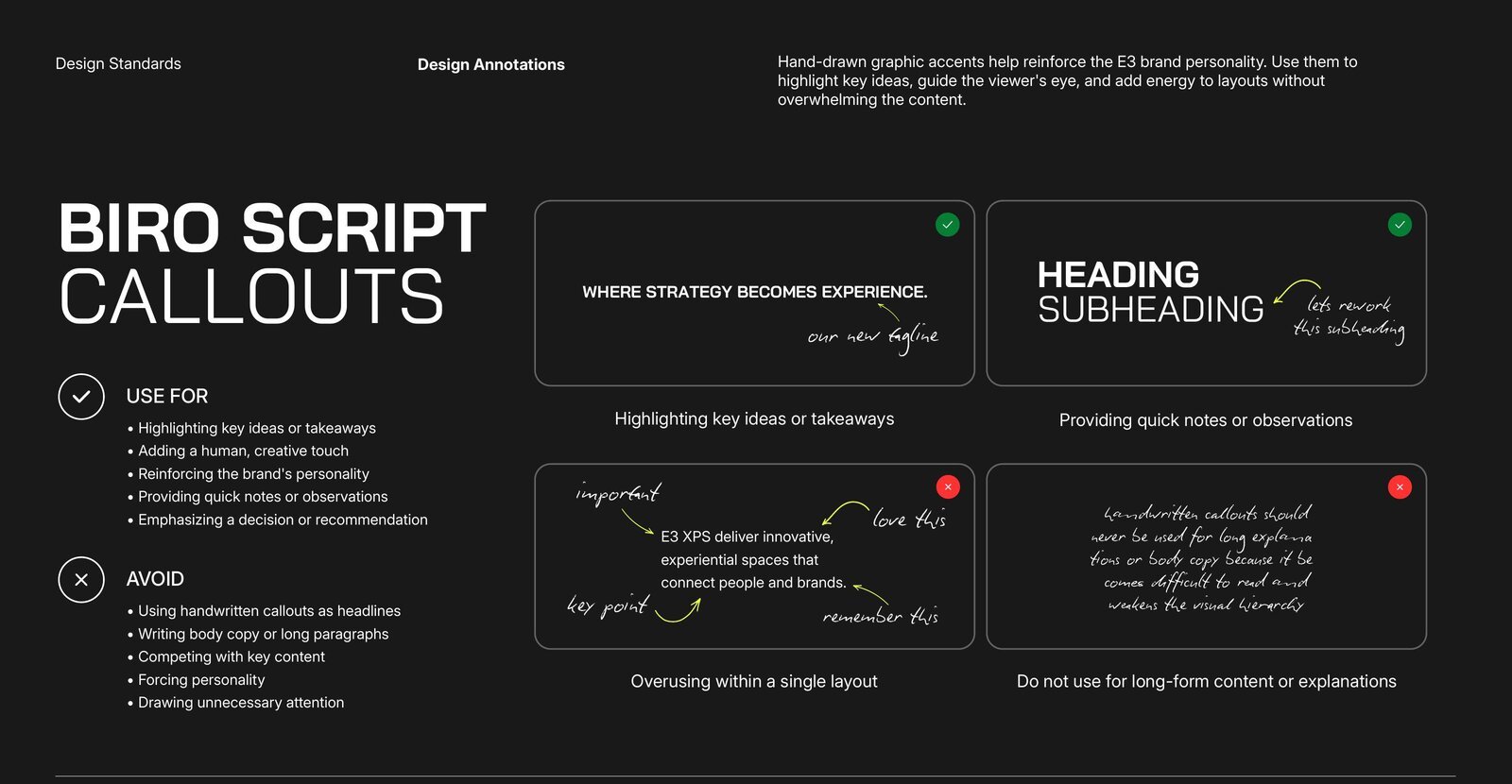
Biro Script Call Outs like this one
✓ Use for
- Highlighting key ideas or takeaways
- Adding a human, creative touch
- Quick notes, observations, or emphasizing a decision
✕ Avoid
- Using handwritten call outs as headlines
- Writing body copy or long paragraphs
- Competing with key content · forcing personality
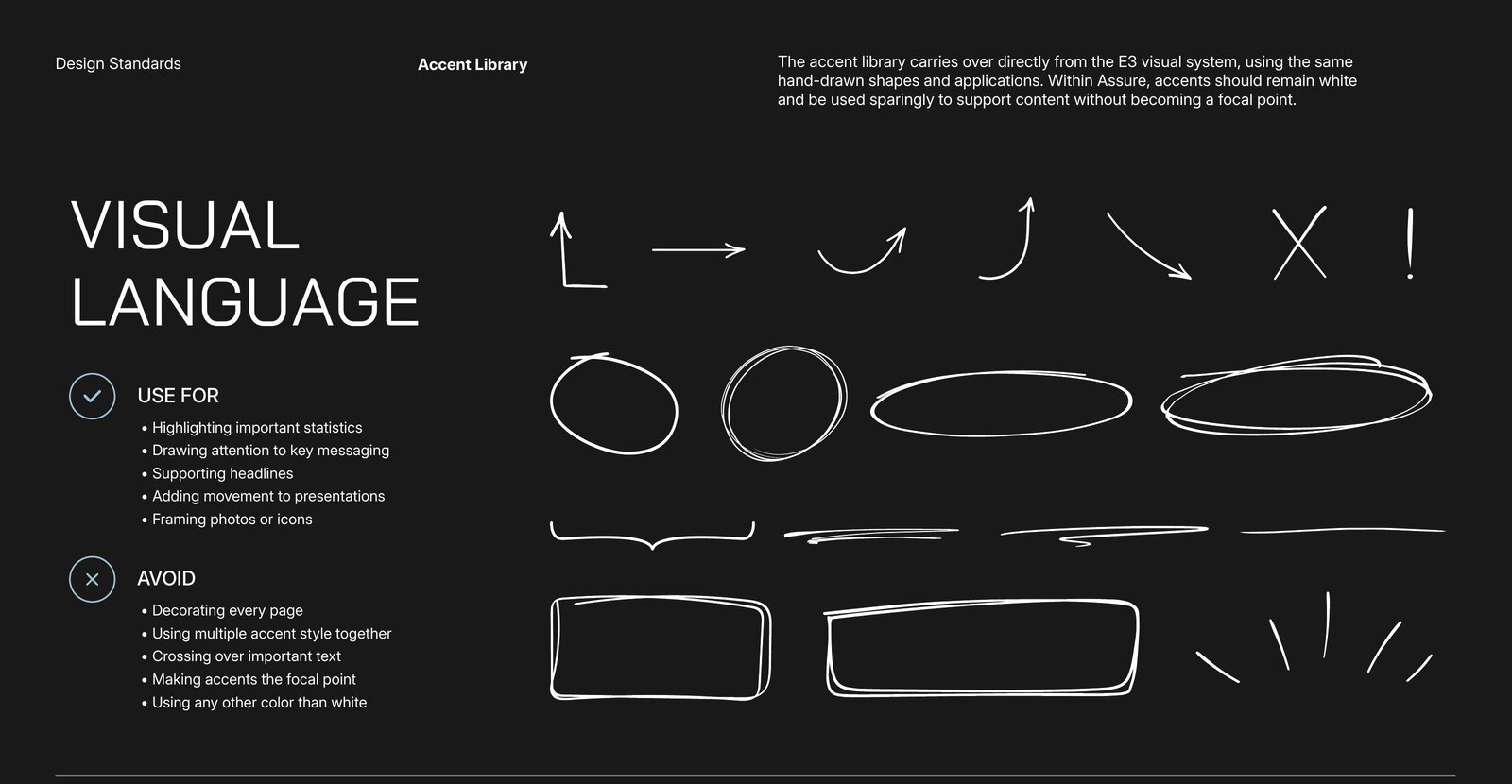
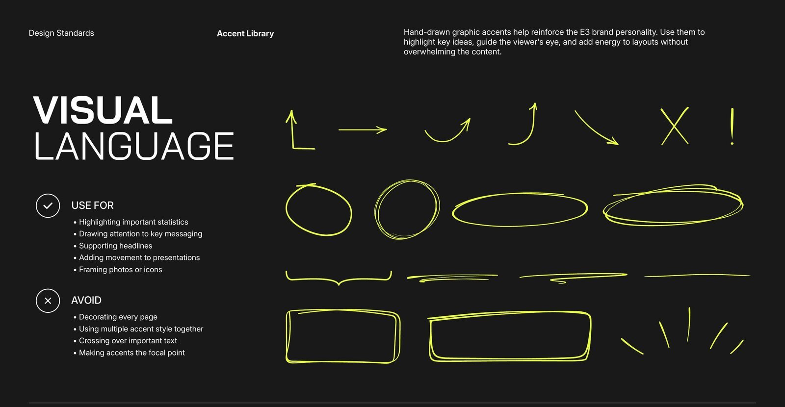
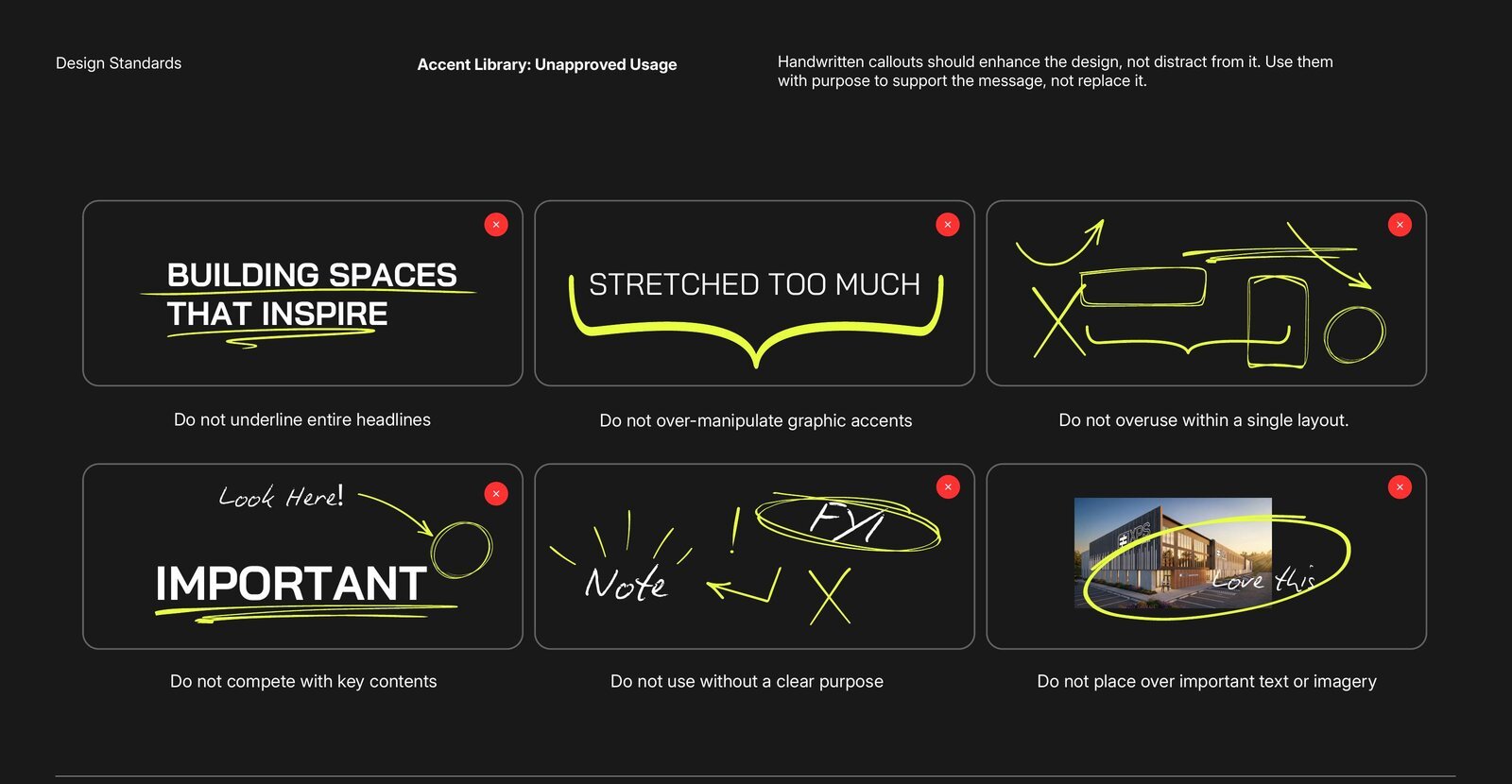
Accent Library
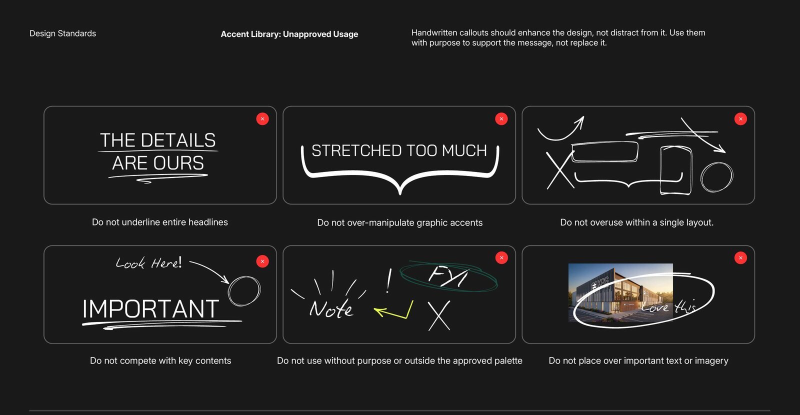
Hand-drawn arrows, circles, underlines, and frames — use to highlight statistics, draw attention to key messaging, support headlines, and add movement. Never decorate every page, mix accent styles, or cross important text.
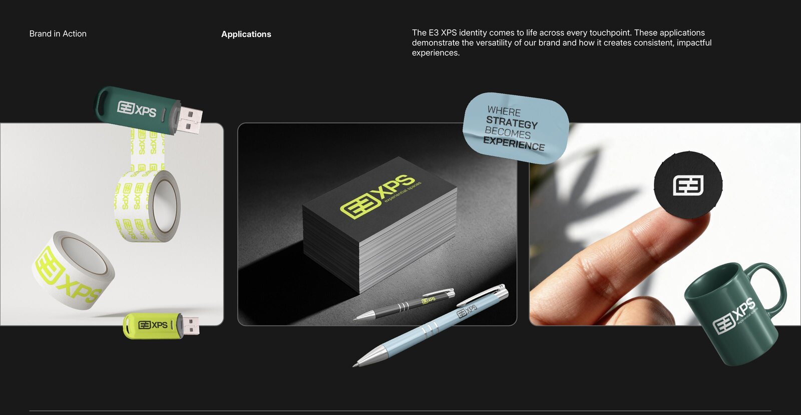
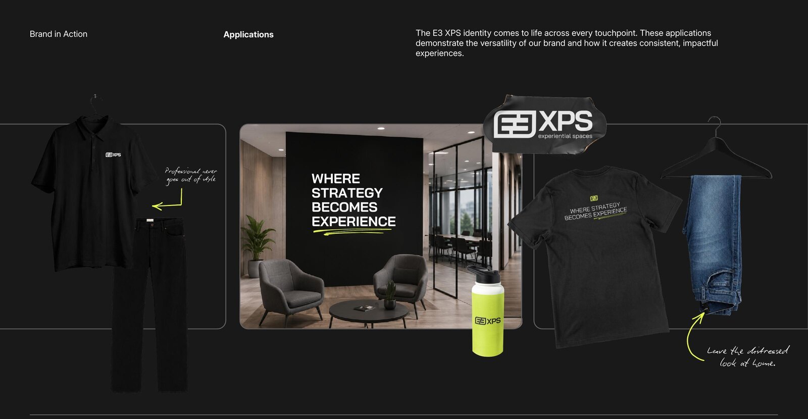
Application Use Cases
Apparel, Hard Goods & SignageFrom apparel and branded merchandise to signage and environmental graphics — how the identity comes to life while maintaining a cohesive, recognizable presence.
Assure — Brand Definition
Sub-Brand of E3 XPS · Exhibit Management ProgramAssure is E3 XPS's exhibit management program, built to keep clients confident, prepared, and always show ready.
Assure brings confidence and consistency to every stage of exhibit management. Built around proactive support and dependable execution, it manages the details that keep exhibit programs moving smoothly. Its personality is calm, capable, and prepared — clients know their program is supported, their needs are anticipated, and they're always show ready. The system builds directly on E3 XPS with one key shift: Coastal Blue is the distinguishing accent, used intentionally and sparingly.
Assure — Tagline
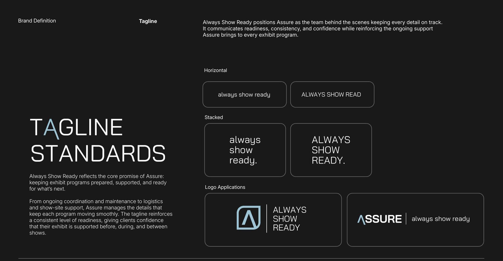
Always Show ReadyAlways Show Ready positions Assure as the team behind the scenes keeping every detail on track — readiness, consistency, and confidence, before, during, and between shows. From ongoing coordination and maintenance to logistics and show-site support, Assure manages the details that keep each program moving.
Approved Lockups always show ready
Horizontal, stacked, and logo-application treatments — sentence case or all caps as shown.
Assure — Logo Standards
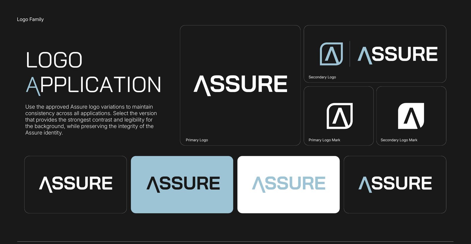
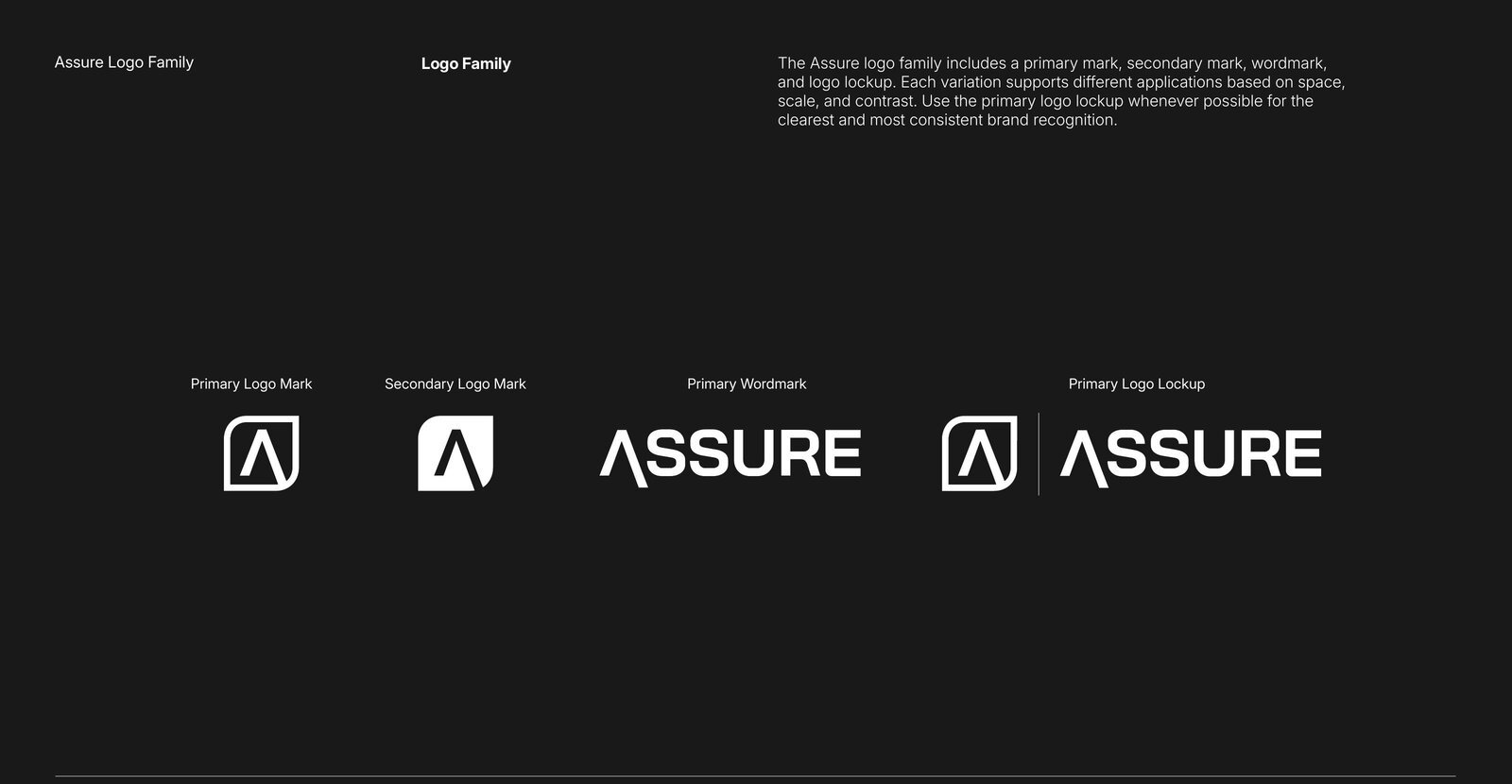
Identity SystemA primary mark, secondary mark, wordmark, and logo lockup — the extended "A" carries the identity. Use the primary logo lockup whenever possible for the clearest brand recognition, and select the variation with the strongest contrast for the background.
Logo Application
Logo Family
Primary Logo Mark · Secondary Logo Mark · Primary Wordmark · Primary Logo Lockup.
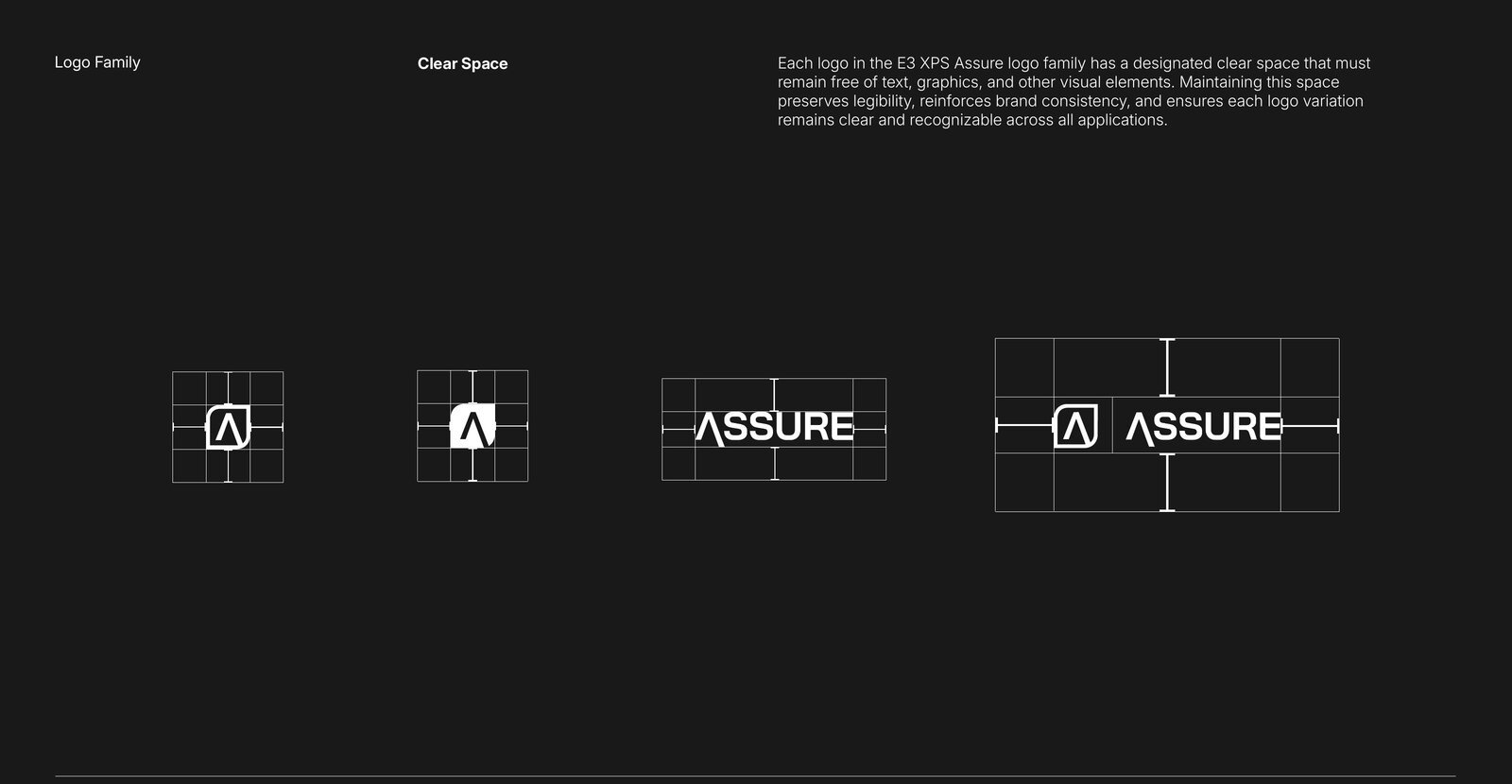
Clear Space
Each variation keeps a designated clear space free of text, graphics, and other visual elements.
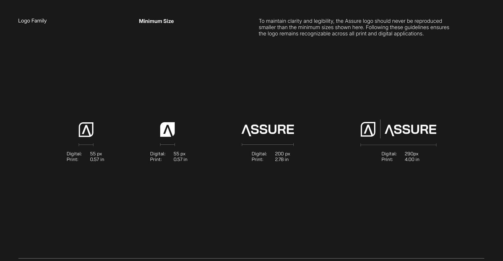
Minimum Size
Marks 55 px / 0.57" · Wordmark 200 px / 2.78" · Lockup 290 px / 4.00".
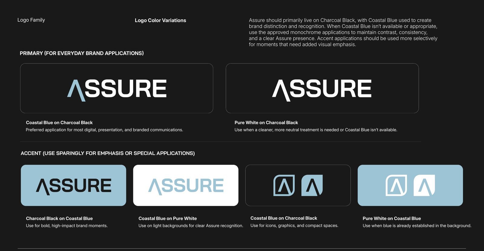
Color Variations
Primary: Coastal Blue on Charcoal Black (preferred), Pure White on Charcoal Black (neutral). Accent combinations sparingly for high-impact moments.
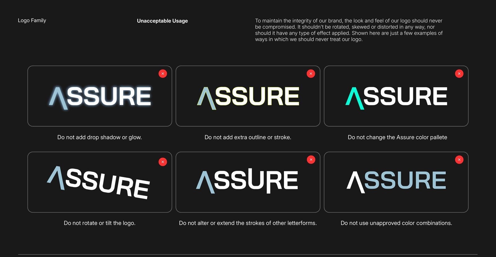
Unacceptable Usage
Never rotate, skew, distort, re-color, outline, add effects — and never alter or extend the strokes of other letterforms.
Assure — Fundamentals
Color & TypographyAssure uses the existing E3 XPS palette — no new brand colors. The difference is intent: Coastal Blue steps up to the secondary role and is used more deliberately to distinguish the sub-brand, while black and white remain the foundation. Click a HEX to copy it.
Note: the deck's Gallery White swatch lists Neon Citrus values (#E8FE41 / PMS 388 C) — a typo in the 9.2 deck; corrected Gallery White values shown above.
Typography
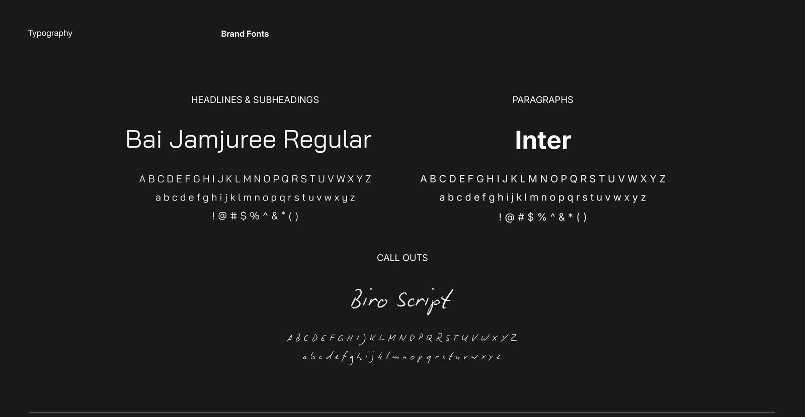
Same type system, one shift: headlines set in Bai Jamjuree Regular — Bold is never paired with the extended "A". Inter for paragraphs; Biro Script call outs, white only within Assure.
Regular · Headlines
Regular · Paragraphs
White only
Specimen
Assure — Design Standards
Controlled Color · Familiar ElementsThe Assure visual language builds on the E3 design system — familiar graphic elements with a more controlled approach to color. Coastal Blue creates distinction; accents and annotations stay white only.
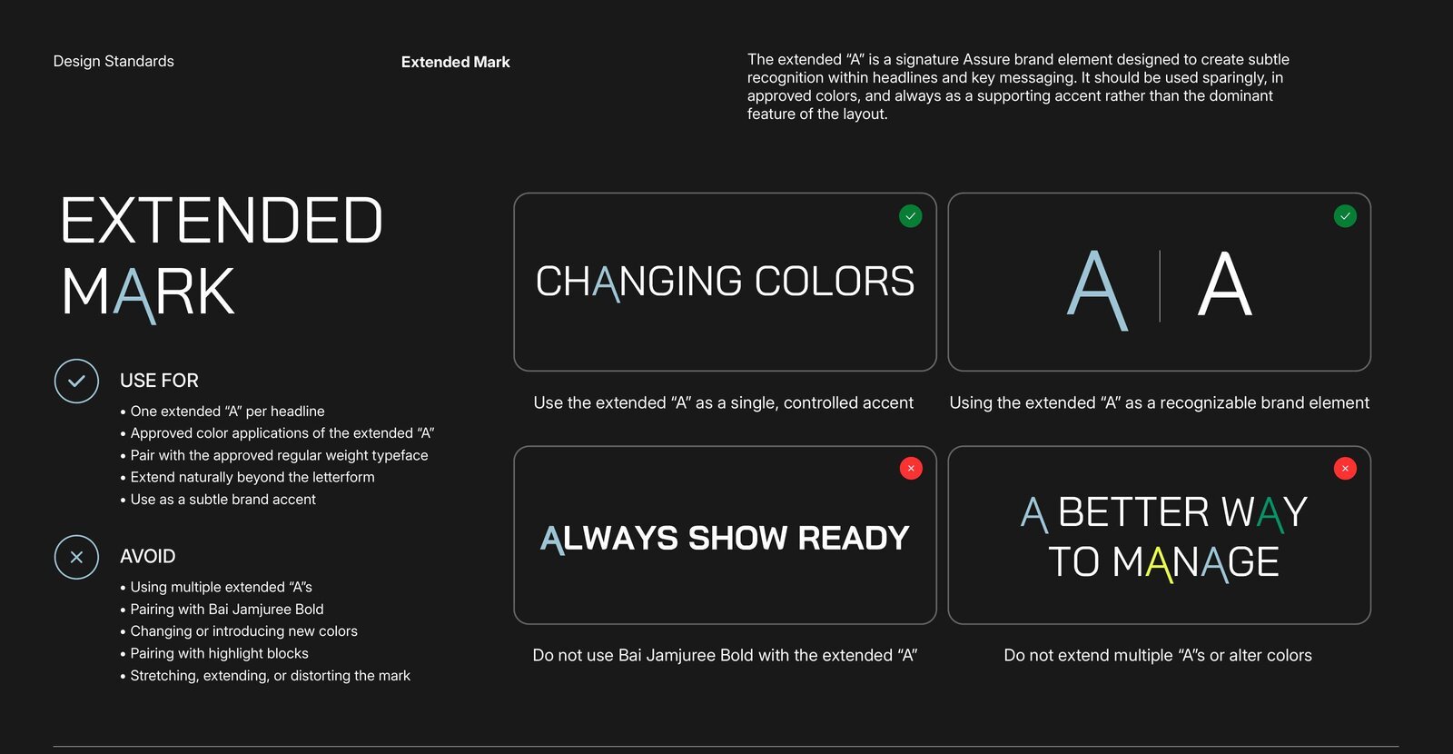
Extended Mark
✓ Use for
- One extended "A" per headline, as a single controlled accent
- Approved colors · paired with the Regular weight only
- Extending naturally beyond the letterform
✕ Avoid
- Multiple extended "A"s · pairing with Bai Jamjuree Bold
- Changing or introducing new colors
- Pairing with highlight blocks · stretching or distorting the mark
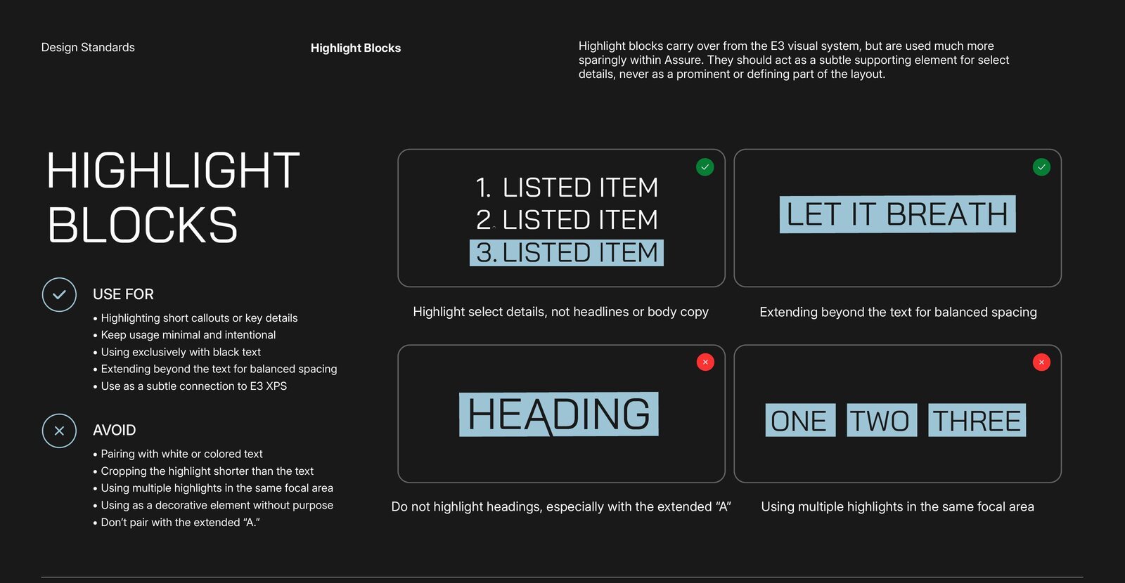
Highlight Blocks
Carried over from E3 — but much more sparing: a subtle supporting element for select details (short callouts, listed items), never headlines or a defining part of the layout, and never paired with the extended "A".
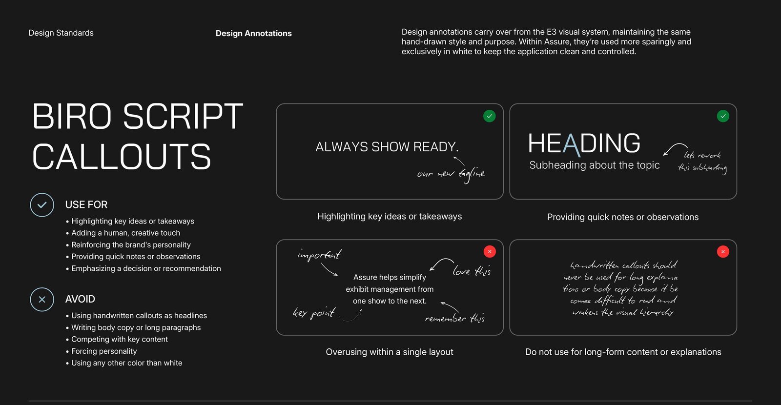
Biro Script Call Outs white only
Same hand-drawn style and purpose as E3, used more sparingly and exclusively in white to keep the application clean and controlled.
Accent Library
The E3 accent library carries over directly — within Assure, accents remain white and support content without becoming a focal point.